Silent Ambassadors: How Typography Shapes Your Brand’s Credibility Before a Single Word Is Read.
Apr 2, 2026
Have you ever wondered why you immediately trust a printed contract set in a classic serif font, while the same words in a playful script font would seem untrustworthy? The answer lies in the psychology of typography. Before we consciously read the first word of a text, our brain has already assessed the visual form of the letters and classified them emotionally.
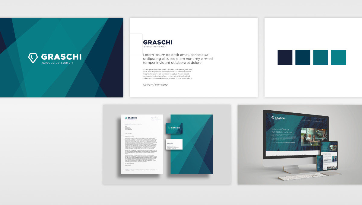
In brand communication, typography is essentially the “voice” of your company. It sets the tone, conveys authority, and determines the approachability of your message. At das formt, we therefore view typefaces not as mere embellishments, but as the strategic foundation of every visual identity.
Visual tone: Form speaks before content
Our brains are programmed to recognize patterns and shapes in a fraction of a second. When a potential customer opens your website or brochure, the typography determines their first impression even before they grasp the meaning of the text.
A well-chosen font creates cognitive ease. This means that when the font matches the content, we instinctively trust the information more. A contradiction between design and content, on the other hand, breeds skepticism—a fatal mistake in B2B sales.
Serif fonts: The language of authority and tradition
Serifs are the small “feet” at the ends of letter strokes. Their origins date back to ancient Rome and the early days of printing.
The effect: Serifs convey stability, seriousness, academic depth, and trustworthiness. They represent the established order.
Usage: Ideal for law firms, financial service providers, or traditional brands in the mid-market. Wherever experience and confidence are the key selling points, a serif font is often the first choice.
Sans-serif: The language of clarity and modernity
Sans-serif fonts do away with all decorative elements. They appear minimalist, objective, and technically precise.
The effect: They convey modernity, efficiency, progress, and a certain “no-nonsense” attitude. They often seem more approachable and democratic than their classic counterparts.
Usage: Startups, tech companies, and digital platforms rely almost exclusively on sans-serif fonts. They are also the champions of readability on screens and fit perfectly with a minimalist, functional brand image.
Typefaces and Hierarchy: Guiding the Reader’s Eye
It’s not just about choosing the right font, but also about how we use it. The psychology of typography uses weight and spacing to establish priorities:
Bold: Signals strength, importance, and “volume.” It serves as a visual anchor for readers in a hurry.
Lightweight fonts: Appear elegant, exclusive, and modern, but require sufficient contrast to avoid losing authority.
Spacing: Wide spacing between letters often conveys a sense of luxury and calm, while tightly set letters convey dynamism and urgency.
Typography as a Tool for Accessibility
Inclusion is an aspect that is often underestimated. Psychologically well-considered typography takes readability for all people into account. Under the Accessibility Enhancement Act (BFSG), the choice of font becomes a legal and ethical necessity. A font with characters that are difficult to distinguish (such as a capital “I” and a lowercase “l”) frustrates the user and disrupts the flow of reading.
Good design here means the absence of friction. Less is often more in this context.
Conclusion: Your corporate typeface is an investment
Choosing your corporate typeface is a decision that will last for years. It shapes the face of your company on every letterhead, every app, and every trade show booth. Strategically chosen typography ensures that your brand is not only seen but also heard in the desired tone.
At das formt, we help you find the “voice” that perfectly matches your corporate identity—strategic, well-founded, and aesthetically top-notch.