The Invisible Power of Letters: Why Your Corporate Font Reflects Your Professionalism
Jun 3, 2026
When you read a text, you hear a voice in your head—and that voice subconsciously determines whether you trust the person you’re reading about or not. In the world of professional brand management, typography is the most underrated element. It is the “tone” of your brand.
While colors are often the first thing people notice, typography is the medium through which your company’s “personality” speaks to you constantly. Choosing the wrong font is like a serious businessman showing up in a clown costume: the message may be right, but the recipient won’t take it seriously.
A professional corporate design uses typography not for decoration, but to subtly plant the brand values in the customer’s mind.
Typography speaks before a single word is read: We select typefaces that perfectly highlight your brand values. Through the strategic use of typography, we sharpen your brand profile and create a visual language that makes your expertise immediately apparent.
1. The “Tone” Principle: What Your Writing Says About You
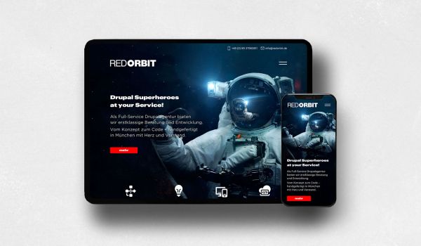
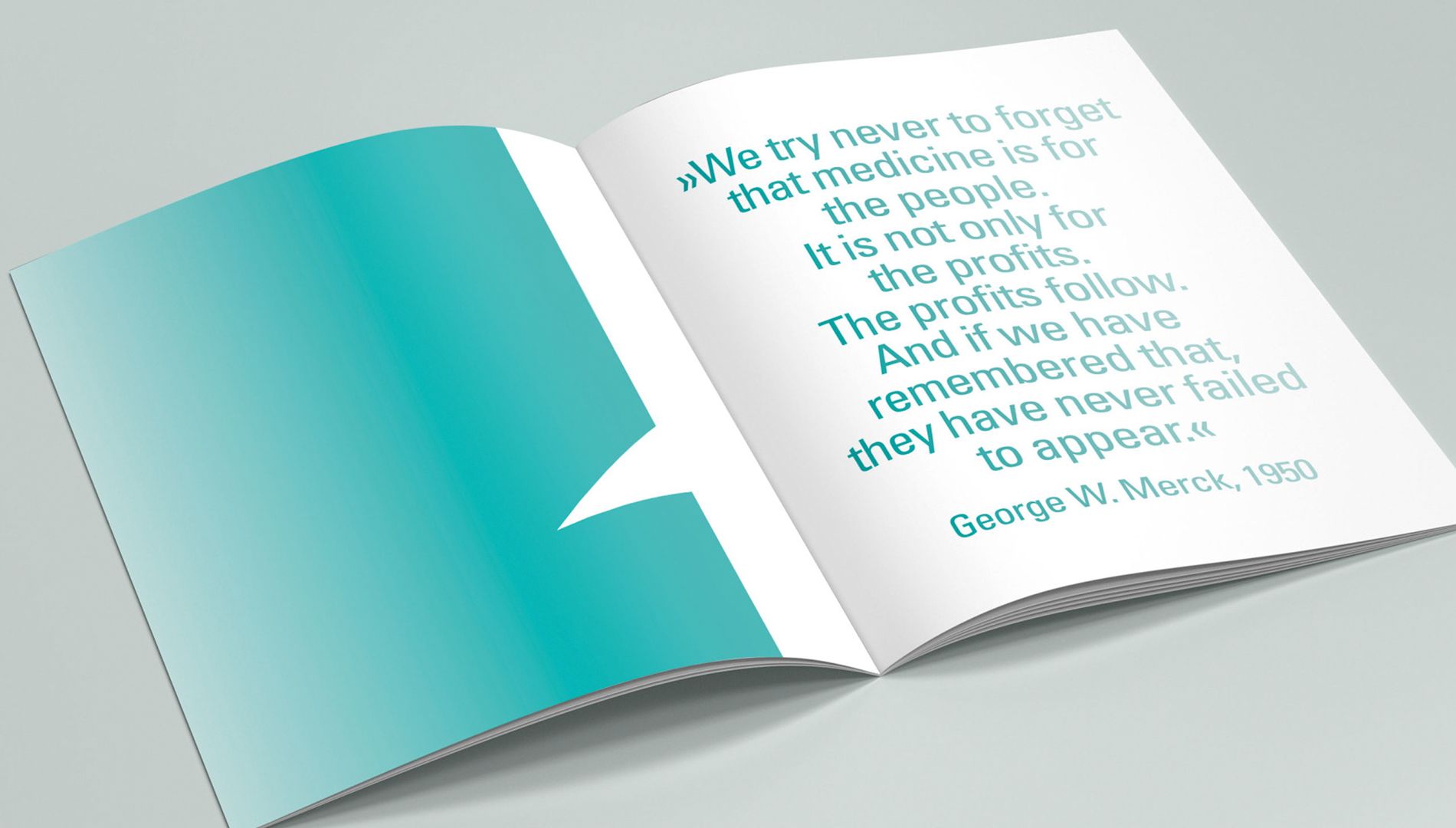
Our brains are wired to associate shapes with emotions. A slim, elegant serif font (with those little tails on the letters) conveys tradition, reliability, and a sense of sophistication. A sans-serif, geometric font, on the other hand, appears modern, technically precise, and forward-looking. The danger: If your website promises “technical innovation” but uses a font that radiates a “cozy country-house idyll,” it creates a disconnect in brand trust. Your customer senses that something doesn’t add up.
2. The Hierarchy of Information: Guiding the Eye
Typography is a tool for visual navigation. A strong corporate design clearly defines how users are guided through your content:
- Contrast: By using different font sizes and weights (bold/light), we guide the reader’s eye. The most important information must stand out the most.
- Readability as a Service: A good choice of typeface shows respect for the user. If line spacing is too tight or letters are too ornate, the user will refuse to take in the information. Professionalism is demonstrated by lowering the barriers to information absorption.
3. Differentiation instead of standardization
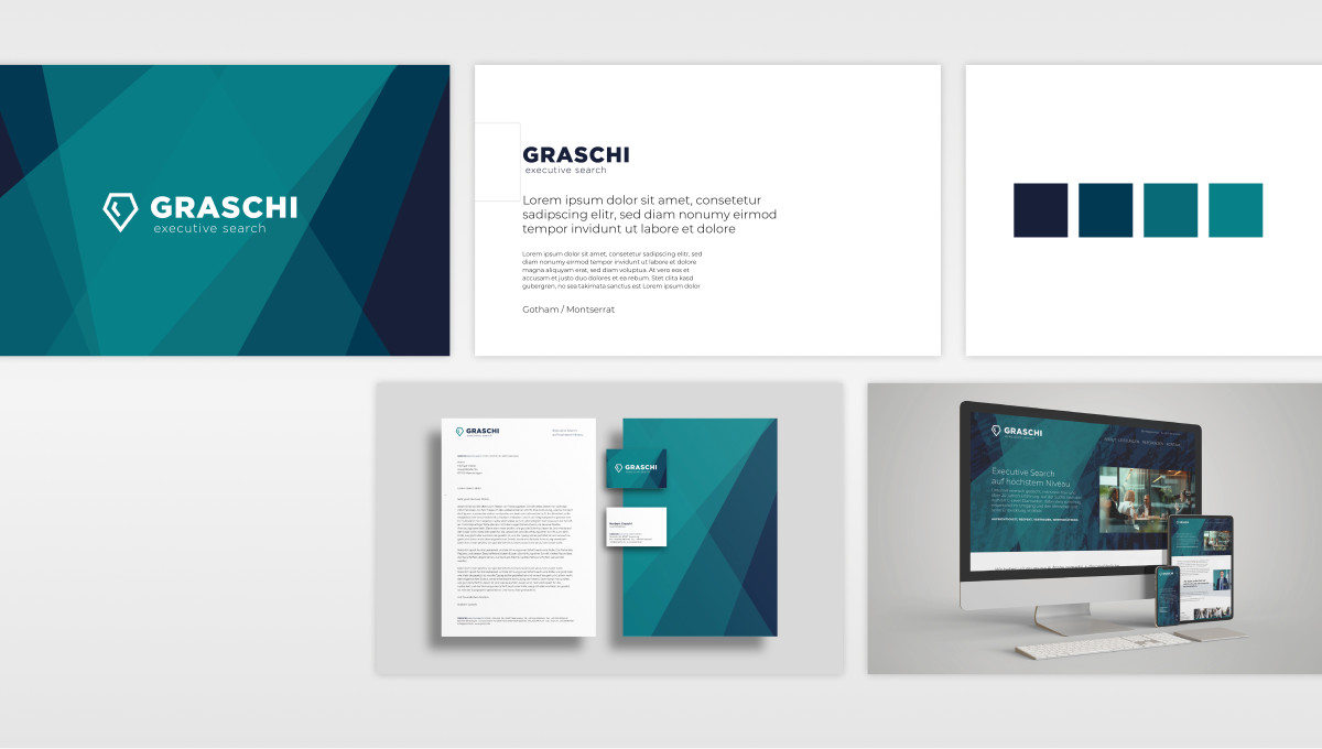
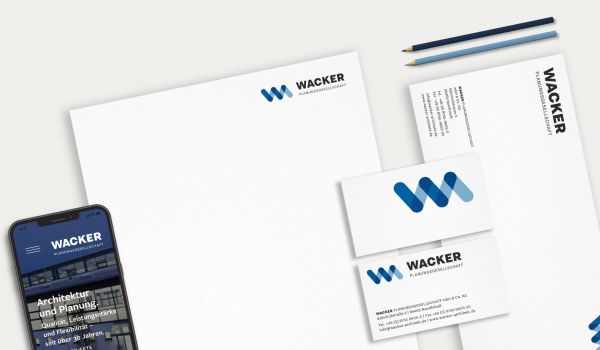
Many companies rely on standard fonts that come pre-installed on every operating system (such as Arial or Helvetica). That’s the surest way to end up looking “just like everyone else.” A well-thought-out typography concept selects fonts with high recognition value—so-called “brand fonts.” This font is part of your digital footprint. When customers see your emails, your website, and your brochures, they recognize your brand solely by the appearance of the text.
4. The Technical Aspect: Scalability and Performance
Typography in modern corporate design must function flawlessly from a technical standpoint. This means:
- Responsiveness: The font must be just as easy to read on a smartphone as it is on a 27-inch monitor.
- Load time: A good custom font must be optimized so that it doesn’t slow down the website. Design and technology go hand in hand here.
It's the little details that make the difference
Your corporate typeface is the “voice” of your company. It works for you around the clock and communicates your values even before the first sentence has been read. An excellent typography concept is not merely a luxury, but an essential building block for being perceived as an expert.
When you hear your current typography—what kind of “character” is speaking to your customers?