The 3-Second Test: Why Your Hero Section Is Key to Your Digital Business Success
Apr 14, 2026
Imagine walking into a brick-and-mortar store. In the blink of an eye, you decide—based on the smell, the decor, the lighting, and the layout of the merchandise—whether to stay or turn around and leave immediately. In the digital space, this process is even more ruthless. Here, the “hero section”—the part of your website that’s visible without scrolling—is your most important salesperson. It’s the digital handshake that determines acceptance or rejection.
Many companies squander valuable potential here by getting bogged down in vague clichés or overwhelming users with visual clutter. Yet a high-converting hero section follows clear psychological principles.
1. The Psychology of the First Milliseconds
People’s attention spans online are now shorter than a goldfish’s. We “scan” rather than read. Within the first 0.05 seconds, a user forms an opinion about the design; within the next three seconds, they decide on its relevance.
This is where the so-called “Grunt Test” (the caveman test) comes in: Could a Stone Age ancestor understand within seconds what you’re offering, how it improves his life, and where he needs to click? If the answer is “no,” your hero section is too complex.
2. The Anatomy of a High-Performance Hero Section
To convert the high number of impressions a website generates into clicks and inquiries, four elements must work together seamlessly:
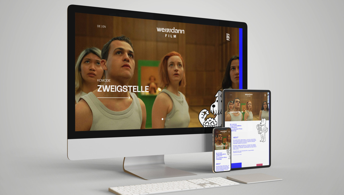
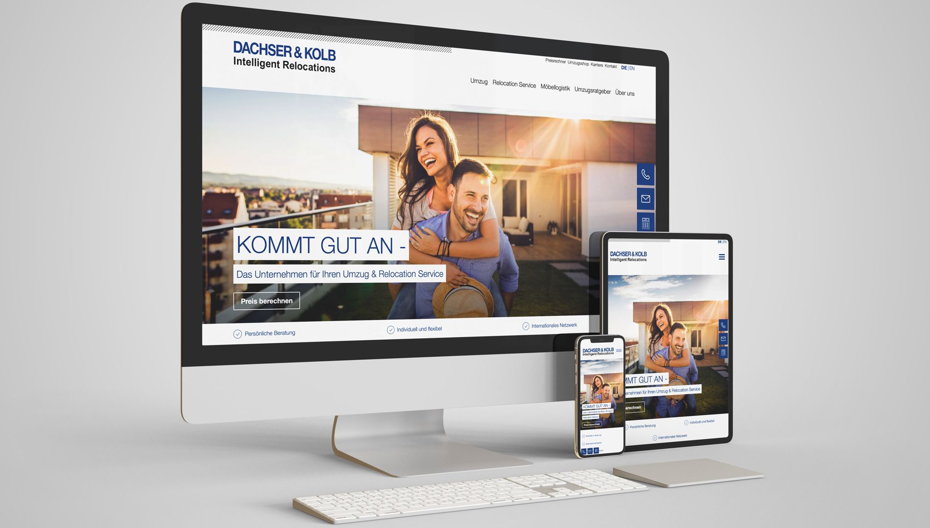
The Headline: The "What" and "For Whom"
Avoid creative wordplay that no one understands. A strong headline identifies the main problem you’re solving. It’s the sign above your digital storefront.
Bad: “Innovation with passion.” (Means nothing.)
Good: “Custom web design for Munich-based small and medium-sized businesses.” (Clear and locally relevant.)
The Subline: The Path to the Goal
Here, briefly explain the process or the specific benefit. The subheading reinforces the headline’s promise and addresses any initial doubts. It’s the reason why the user should stay.
The Call to Action (CTA): Clear Guidance
A user without guidance is a lost user. Your CTA must stand out clearly in color and provide a clear call to action. “Learn more” is often too weak. “Start your project now” or “Book a free initial consultation” is much more compelling.
The visual anchor system (hero image)
The background image isn’t just for decoration. It serves as an emotional booster. Don’t just show your product or your office building—show a “successful customer” or the problem that’s been solved. Ideally, the people in the images should be looking toward your CTA (directional cueing).
3. Layout Structures: F- and Z-Patterns
We know from various eye-tracking studies that there are certain patterns in the way users scan websites.
- The F-pattern: Common on text-heavy pages. The eye moves from the top left to the right, then slightly lower down, again from left to right.
- The Z-pattern: Ideal for minimalist hero sections. The eye moves from the top left (logo) to the top right (contact/menu), then diagonally to the bottom left, and finally horizontally to the right toward the CTA.
A strategic design takes advantage of these natural reading habits to place the most important information exactly where the eye naturally falls.
4. Mobile-First: The Hero on the Smartphone
A common mistake is simply scaling down the desktop view. On a smartphone, space is even more limited. Here, the hero section must be drastically reduced. The image is often moved to the background or replaced with a bold solid color so that the text and button remain large enough for the user’s thumb.
Design is the absence of friction
An excellent hero section isn’t a work of art—it’s a precise tool. It takes visitors by the hand, builds trust within seconds, and clears away all cognitive barriers. When your hero section works effectively, your bounce rate drops and the quality of your leads increases measurably.
Is your website ready for the 3-second test?