Mobile-First: Why it’s not enough to simply “shrink” your website.
Mar 25, 2026
Everyone talks about "mobile-first," but the reality on German B2B websites often looks quite different: tiny buttons, endless walls of text, and frustratingly slow load times. Yet today, even in small and medium-sized businesses, the most important decisions are made on smartphones. Find out why true mobile design requires a completely new way of thinking and how you can reach decision-makers where they spend most of their time—on their phones.

“Our customers are sitting at their desks in the office.” This statement is one of the most dangerous misconceptions in modern marketing. Yes, the final order or the technical deep dive may take place on a large monitor. But the initial decision, the first research, and the “vibe check” happen today in a taxi, at the airport, or during a coffee break on a smartphone.
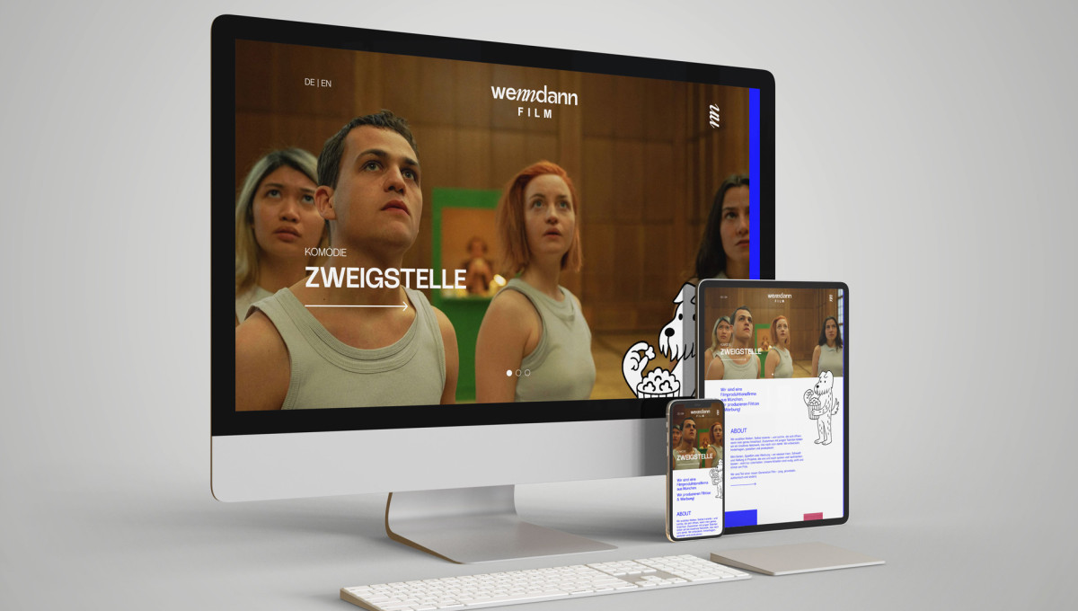
Responsive doesn't necessarily mean optimized
Technically speaking, almost all websites today are “responsive”—meaning that the elements somehow shift around as the screen gets smaller. But is that really a good thing? Usually not. True mobile-first design means designing the user experience starting with the smallest screen and focusing on the essentials.
3 pillars for a truly mobile experience:
1. Thumb-friendly design instead of mouse pointers
Desktop users are precise. Mobile users rely on their thumbs. At das formt, we design interactive elements so they can be operated without frustration. “Fat Finger Syndrome” is no joke—it’s a conversion killer. Spacing, button sizes, and form fields must be designed with touch-based interaction in mind.
2. Radical Content Focus
On a smartphone, there’s no room for lengthy introductions. We prioritize your messages. What does the customer need to know immediately? What’s the most important action? We use “progressive disclosure”—we show the most important information first and offer depth when needed. This keeps the page clear and users happy.
3. Contextual Performance
Mobile users are often distracted and don’t always have 5G reception. A mobile site must “fly.” Every kilobyte we save increases the likelihood that the user won’t bounce. We optimize images and scripts so that your brand shines even with poor reception.
Conclusion: Mobile-first is a mindset, not a technical feature
Those who take "mobile-first" seriously win the trust of decision-makers during those crucial first moments of research. We create web designs that don’t just work on every device—they delight users. Because a good first impression can’t be scaled—it has to be spot-on from the very first click.