Smart UX Design: How to Structure Complex Offerings for High Conversion Rates
Jun 16, 2026
Anyone offering products, software, or specialized services in the B2B sector that require explanation faces a digital Herculean task: How do you break down decades of expertise and highly complex processes in a way that prevents potential customers from immediately giving up in frustration on your website? Too much text overwhelms the user; too little casts doubt on your technical expertise. The key to success lies not in reducing content, but in an intelligent information architecture that appeals to both rational decision-makers and emotional users at the same time.

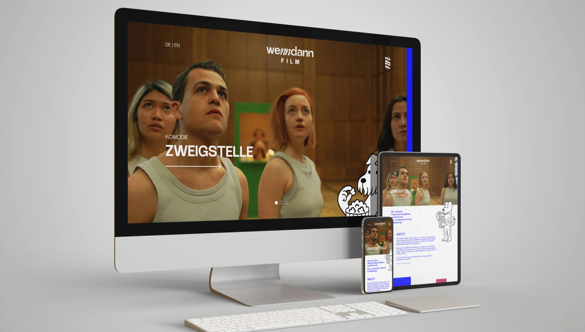
In B2B web design, the structure of a services page determines whether a lead enters the sales process or leaves the site to go to a competitor who can explain their offering more clearly.
Making complexity understandable: We structure your B2B service pages according to psychologically sound principles that make the value of your work clear in a fraction of a second. Through a well-thought-out UI/UX design, we guide decision-makers directly to a qualified inquiry without any friction.
The Hero Section as a Relevance Filter
A B2B decision-maker doesn't have time to spare. When they visit your services page, they need to be able to answer three questions within three seconds:
- What does this company offer?
- What specific problem does this solve for me?
- What is the next logical step?
Visual design: Avoid vague marketing clichés (“We maximize your synergies”). Opt for a clear, precise headline, a benefit-oriented subheadline, and an unmissable call-to-action (CTA). The design needs to breathe—plenty of white space around the core message signals its importance and ensures immediate focus.
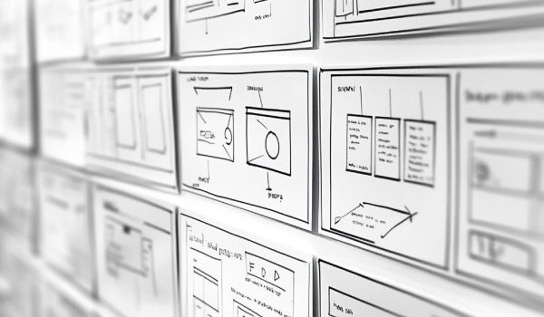
Progressive Disclosure: Information in Small Bites
The biggest problem with traditional B2B websites is the phenomenon of “information overload.” The user’s brain shuts down when faced with dense blocks of text. This is where the UX principle of progressive disclosure comes into play.
We structure the content hierarchically:
- Level 1 (The Foundation): A concise headline and a teaser sentence explain the feature or benefit at a glance.
- Level 2 (The Details): Through interactive elements such as accordions, tabs, or “Learn More” links, the user receives the technical details exactly when they are actively looking for them. This keeps the page visually clean and doesn’t overwhelm the quick skimmer, while still providing the in-depth analyst with all the necessary facts.
The Feature-Benefit Framework: Translating Features into Benefits
B2B companies are often proud of their technical specifications and features. But a buyer or business owner doesn’t buy features—they buy the results.
- Feature: “Our software features an automated AI interface.”
- Benefit: “Save 14 hours of administrative work per week with automated processes.”
Design tip: Use visual cues such as custom icons, infographics, or before-and-after comparisons to visually reinforce these value propositions. The brain processes graphics 60,000 times faster than plain text.
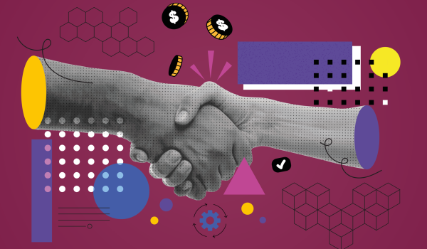
The logical conversion bridge: The right CTA
A perfectly structured service page should never end with a generic “Contact Us.” The call to action must be precisely tailored to the stage of the B2B decision-making process. Since B2B investments are often high-priced and time-consuming, a direct “Buy Now” button is usually inappropriate. Instead, offer low-risk, smart next steps: “Request a feasibility analysis now” or “Schedule a consultation with an expert.”
Conclusion: Structure is the best salesperson
Good B2B web design simplifies complex concepts without making your offering seem trivial. By consistently aligning the information architecture of your service pages with your target audience’s information needs and reading habits, you can shorten the sales cycle and turn passive readers into valuable pipeline leads.
Does the structure of your service pages reflect the true brilliance of your offering?